 +971 50 810 2997


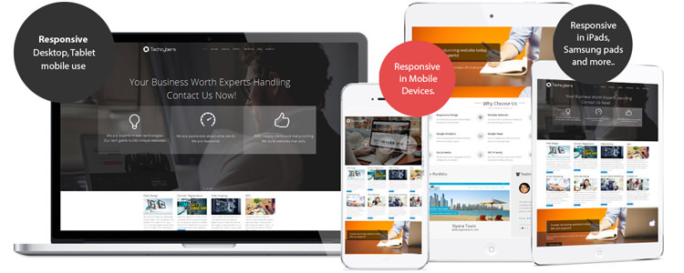
Why Need Mobile Responsive Web Design

Features of having mobile responsive design:
1. Google Gives High Priority for Responsive Web Designs.
2. No Need Multi Versions of Your Website for Mobile and Desktops.
3. In Mobile Device No Need to Zoom or Slide right or Left to See Your Content.
4. Smooth User Experience.
5. No Need Redirects to Mobile Site.
6. One Management System to Update Content for Mobile and Desktops.
7. Flexible Navigation Styles.
How Responsive Design Works?
The word “responsive” in web design field means that the entire layout responds based on the user’s screen resolution or the device which he or she opens the website. There are situations that a person were browsing a website on his tablet, then switched to another device for one reason or another. In this case the browser window will re-sized automatically. A responsive Responsive Design layout will automatically adjust the resolution according to the device.
Why Design for Mobile?
It is true that more users are going mobile and spending more time in mobile devices, and not just for on-the-go web browsing either.
“In this era designing for mobile is certainly a requirement in modern day web design standards.”
Mobile Responsive Design is The Future of The Web
Mobile Responsive Design is all about automatically delivering your audience the content they want, within the context that they’re viewing it.
It is revolutionary for online publishers, because (for most) responsive design eliminates the need for multiple versions of your site, or expensive app development and maintenance.
Conclusion
Responsive design is pretty cool. You can drag and drop the browser window smaller and bigger and watch the website content change according to the size of the window. This is applicable for testing purpose only.
Like Us on Facebook:
Follow Us on Linkedin:
If you are looking for a web design dubai based company for your website design work, then you must contact us for a better web design deal. Choosing your web design dubai based company really matters for your company web design work.